
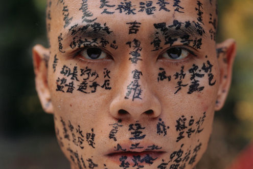
Artist: Screen Prince
Title: Momma Loves Me
Medium: Silkscreen
Family Tree
Portrait Experience
- Hong Kong
- Nepal
- England

 |
| Practise 1 |
 |
| Practise 2 |
 |
| Practise 3 |


Practise 1- Hong Kong


Practise 2 - Nepal
|


PRACTISE 3 - UK


TURSP EXPERIMENT


Close ups


Practise Piece

The board’s texture is fairly rough which gave this piece some additional texture also having a great effect to create the piece more vibrant.


I considered the background colour which would be suitable both for dark and light colour. I decided to use dark royal blue as used by my chosen artist Screen Prince. I applied a good amount of acrylic paint using a thick brush to make the colour opaque because the white paper would contrast with dark royal blue paint which would likely to draw an unintended attention. Thereafter, I used a 3b Hb pencil to create a continuous line drawing of my face. Then started to fill more detail using charcoal (black) and chalk (white) on the eyes which for me is the best starting point for a portrait because by now I have learnt to scale the rest of the face depending on where the eyes are…
I used chalk as a means of presenting influences of which I was effected at “5 years” old which are one of the few words clearly understood.
I have used chalk for the texts which would contrast the black charcoal that I used for the hair as to balance out the whole piece. As the atmosphere of the piece is in the past I have warily smeared the old influences to move forward on to the next.


I started with an observational drawing using 2Hb pencil to get the rough measurement of the side portrait. For this piece I decided to use ink print, as I had experimented with the ink print which I believe to be very profound technique to present this particular piece as I was influenced with the “£” sign.
Knowing the ink print would be quite dark and opaque, I replaced the outline of the face bolder using charcoal to prepare for the dark and opaque ink print.


I have used the main section (Queen’s head) from a “£” bank note.


The neck section is where I had printed my name in Nepalese text, whereas from a further distance it looks an abstract calligraphy rather than an existing lettering.
Which in my prospective is a positive outcome as it really engages with the rest of the piece.

Here I have added black and white for the background and for my flesh I have used tea bag placing it on a hot water to get the translucent brown colour.

Here I have got a photocopy of the £10 bank note to trace the queen’s head onto my piece.
I seemed to be lost around the time, therefore to reflect this atmosphere, I asked for suggestions from my surroundings while in the middle of the process of creating this piece. The strongest feedback I received was from my teacher “how about clear your mind and develop”. It took me some time to decide to “clear” off my piece but I felt that the current situation of the piece wasn’t very effective. Therefore, I covered a section of the background and my face with white emulsion and smeared off all the shapes, signs and symbols off from side of my head. As you can see on the left image. I then dragged the white emulsion off from the background to my face to illustrate that I had cleared my mind and made room for developments. This led me to set developments for my next piece.


Here I have repainted the background to its original colour and covered my four senses. As I wasn’t too proud of this final outcome, I have set myself developments for the next piece;
- Use colours that match the overall composition.
- Keep simple and not to add too much which may ruin the whole piece.

Here I have started with pencil drawing of a side view portrait. As I noticed that I have developed my drawing skills from practising a number of times.

I have divided the background into two; black and white, as to keep in the same theme as where I had started my journey.

Here I have used spirit to transfer the ink onto my portrait to illustrate my influences.

The am pleased of this final outcome as I have met all the developments which I set up for myself from the last piece.
FINAL PIECES


No comments:
Post a Comment